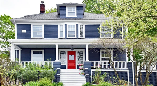
This year’s trending house colours are big on contrast.
By Tammy Adamson-McMullen
Each year, the trends in home exterior paint colours shift. This shift is dependent on lots of factors, such as the economy, the overall mood of the country, political unrest, advancements in colour technologies, consumer colour confidence and more. Sometimes the shift is gradual, other times it’s more dramatic. This year, it’s both.
Popular exterior colours have been evolving for several years but have made a bigger leap into a palette that is soothing yet full of contrasts. This leap undoubtedly is a result of the uncertain times in which we find ourselves, as consumers seek solace in colours that bring them comfort. But these colours often are used with contrasting neutrals and occasional pops of colour—suggesting perhaps that while consumers need a bit comfort, they’re also hopeful that tomorrow will be a brighter day.
Below are five of the emerging colour palettes. One word of caution: The hues in contrasting colour schemes need to be chosen with care, or they can appear garish. For assistance with your colour selection, talk to the professionals at your local paint and decorating store.
Creamy White/Charcoal/Shades of Oceanic Blue
Whites continue to dominate in siding colour because they’re easy to work with and generally are considered more marketable. That being said, white in 2020 isn’t standing on its own but is being mixed with other colours to create the ultimate in contrast and curb appeal.
A popular combination combines creamy white siding and trim with charcoal window and door casements and an ocean blue door and shutters. You’ll see a range of blue in this scheme, from light Caribbean aqua to deep-sea blue and a rich teal. A bolder variation on this scheme also is popular and features oceanic blue as the main house colour with white trim, darker blue shutters, and charcoal for the front door and casements—with charcoal sometimes deepening almost to black. Tip: Light sky blue can replace oceanic blue in either scheme for a fresher look.
Moss/Cream/White or Cream/Darker Moss/Wood Stain
Like blue, shades of green also are soothing colours. This year, you’ll see cool to warm shades of green on the exterior used with darker or lighter shades of the same colour, clean neutrals and natural wood tones. Cooler greens have an undertone of blue and sometimes appear as a gray-green. Warmer greens have undertones of yellow—and in 2020 are an updated version of olive.
An example of one of the newer yellowed greens is moss. A currently popular scheme combines a lighter moss as the main house colour with white or cream trim, dramatically darker moss casements, and honey-stained doors. The honey stain in this scheme shows up primarily on the front door and garage doors but can be used on other wooden accents, too, such as planters, window boxes and decks.
Light Blue/Clean White/Darker Blue/White/Orange
This colour scheme combines elements of the previous two. It pairs a light and slightly grayed blue for the main house colour with clean white trim, darker grayed blue shutters, and a soft orange front door (created either with paint or an orangey wood stain).
For less punch where the orange is concerned, select a soft squash or ginger colour for the door; for more punch, use bright carrot. Try to avoid using orange on garage doors, too, as too much of the colour can be overwhelming. Instead, sprinkle in some copper—in exterior lighting fixtures, flowerpots and planters. To further tie the scheme together, paint or stain your porch floor in the same blue as the shutters.
Light Blue-Green/Clean White/Buttercup Yellow
Cool blue-greens like new sage also are taking center stage as the main house and door colour, often used with clean white as the trim—or vice versa. These two colours look oh! so fresh alone and play beautifully off one another. But they look even fresher when another fresh colour is added to the scheme, such as buttercup yellow.
This green/white/yellow scheme plays out most beautifully when buttercup is used for the casements and front door. For more contrast, use a slightly brighter shade of yellow; but don’t get too bold, or you’ll take away from the overall freshness of the scheme. Set off the look with yellow porch Adirondack chairs and clean white flowerpots filled with yellow flowers.
Shades of Greige/Raisin
Greige—a combination of gray and beige—is on the rise in both interior and exterior colour schemes. This lovely, soothing colour works with just about any style of home and, like white, is easy to work with in any shade.
This summer, you’re bound to see more use of the colour, typically used as the main house colour with an even lighter shade of greige for the trim and dark raisin for the front door. Sometimes greige appears with black or charcoal instead, with these darker colours appearing in casements as well. Raisin likewise can be used for the window casements for a more dramatic appearance. Raisin, incidentally, also works well as a front door colour in the previous moss green scheme. Tip: For a change-up to this scheme, use a soft brown for the main house colour and white—or even a darker brown—for the trim colour. Soft browns also are on the rise and, again, work well with raisin accents.

