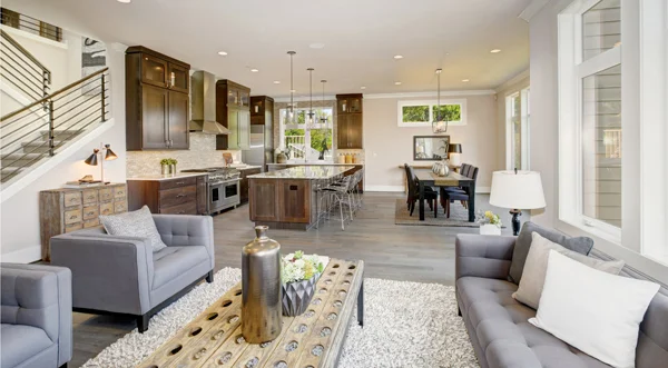
To create a cohesive look for your home, it’s important to come with a colour scheme that flows and coordinates from room to room.
By Diane Franklin
Whether you’re painting your home’s interior all at once or doing it a room at a time, one thing is certain: You want to tell an appealing colour story. The best way to do that is by using colour consistently and cohesively. Colour variety is fine, but the colours should flow from one room to room without being jarring or disharmonious.
If you’re painting your home interior over a period of several months (or even over a couple of years), a good idea is to plan all the colours in advance with an eye toward achieving the desired cohesive result. One way to do that is by looking at the colour cards and colour brochures at your local paint store.
Some paint manufacturers have created colour collections with specific themes, such as colonial or historic colour palettes or others that focus on a specific decorating style. These collections feature a full range of colours that are designed to work together. If any of these collections fits the style of your home, then much of your work has already been done by the colour experts who have compiled these pleasing palettes.
Many paint stores also have colour experts on their staff who can help you pull together a cohesive colour plan for your home. By determining a plan for your entire home ahead of time, you can rest assured that all your colour choices will work well together. You won’t have to labor over picking colours each and every time you paint, worrying that the colours you’ve selected for your latest paint project will clash with the colours you previously put on the wall in an adjacent room. You will already have confidence that your colour plan will work, based on the colour selection process you went through and the validation of the colour expert who helped you make your choices.
Here are several ideas to keep in mind as you develop your colour plan.
Consider the Floor Plan
Today’s open floor plans make it more important than ever that a home have a pleasing and cohesive flow. Choose a colour that works in your main public space—i.e., the great room or living room/dining room combination. Typically, a warm neutral works well in these spaces. Grays are extremely popular right now, but other colours that work well in large spaces include taupes, beiges, creamy yellows and off-whites.
Of course, you don’t have to stick with a “safe” choice if you want to show more personality. A sage green, navy blue or cranberry red can work if the space is big, open and has plenty of natural light. You can use such a colour as a feature wall if you want just a touch of drama while still keeping a neutral colour as an anchor for your colour scheme.
Make sure you consider the sightlines when you choose colours in rooms that flow from one to the other. For instance, the colours in the kitchen shouldn’t clash with those in the great room. If you’re standing in the foyer, make note of what you see in front of you, on either side of you and above you to ensure that all the colours that go on those spaces coordinate well with one another.
Make Compatible Choices
Choose a palette of hues that are proven to work well together. You can take a monochromatic approach, for instance, and use various shades of gray, going from light to darker. When using non-neutral colours, take a look at the colour wheel to choose colour schemes that have been proven to be compatible, such as complementary, split complementary, analogous and triadic.
While each room may have its own wall colour, you can still provide consistency with other elements that you use in every room, such as white baseboards, oak hardwood flooring or alabaster blinds. If you create that consistency of colour with features such as these, then variations in wall colour will work well because they are anchored by other elements that establish and maintain the flow.
Be Daring in Private Spaces
You have more latitude in making colour departures in private spaces such as bedrooms or bathrooms versus public spaces like your great room or kitchen. As an example, a child’s room is a great space to go a little wild with a wall mural painted in greens and purples. Even those colours aren’t going to clash with the neutrals tones that may dominate elsewhere in the home.
Don’t Be Boring
While colour consistency and flow are important, you don’t want to make your home boring. Add some visual interest with unique furniture pieces or light fixtures. Provide pops of colours with accessories, wall art, accent pillows and wallpaper—even a faux-finished niche. Use texture and layers to add even more visual interest.
Once you have your colour scheme in place, all of the other elements will work to make your interior the warm and inviting place that you want it to be.

